
You’ve got three browser tabs open. One says “small caps,” one says “superscript,” one says “subscript.” You paste the same word into all three, copy each result, and paste them one at a time into your Instagram bio to see which one looks right. On your phone, one version looks clean, one looks slightly off, and one has a letter that clearly didn’t convert. You close two tabs and keep the third open just in case, still not sure you picked the right one.
That confusion is the whole problem this post solves. Not what subscript or superscript technically is, but which one you should actually paste into your bio, and why.
Quick Answer
If you just want the short version, here it is:
- Use small caps for a full name, word, or short tagline. It has the most complete alphabet, so it reads cleanly with no missing or substituted letters.
- Use superscript for a short subtitle line under a normal-text name, like a raised tagline. It looks intentional in small doses but gets harder to read in long phrases.
- Use subscript only for short words or single accent words, and only if the word avoids letters that don’t have a true subscript form.
The decision rule is simple: the longer and more “normal word” your text needs to look, the more you should lean toward small caps. The shorter and more decorative the accent, the more superscript or subscript become fair options.
Small Caps, Superscript, and Subscript in One Line Each
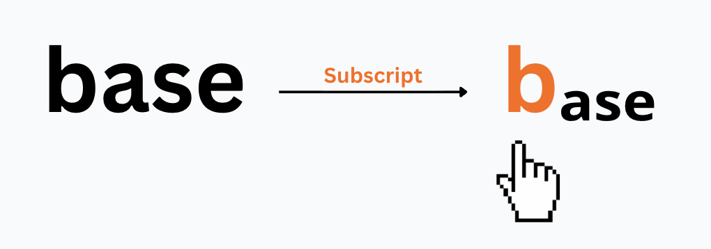
Small caps takes your letters and renders them as tiny capital letters, so a lowercase word still looks like it’s shouting quietly. Superscript lifts letters above the normal line, the same style used for footnote markers or exponents like x². Subscript drops letters below the line, the same style used in chemical formulas like H₂O.
That’s the surface difference. If you want the deeper technical breakdown of how subscript and superscript specifically compare, including their shared history in the Unicode standard, that’s already covered in our subscript vs superscript guide. This post is about which one you should pick for a bio, not how they’re built.
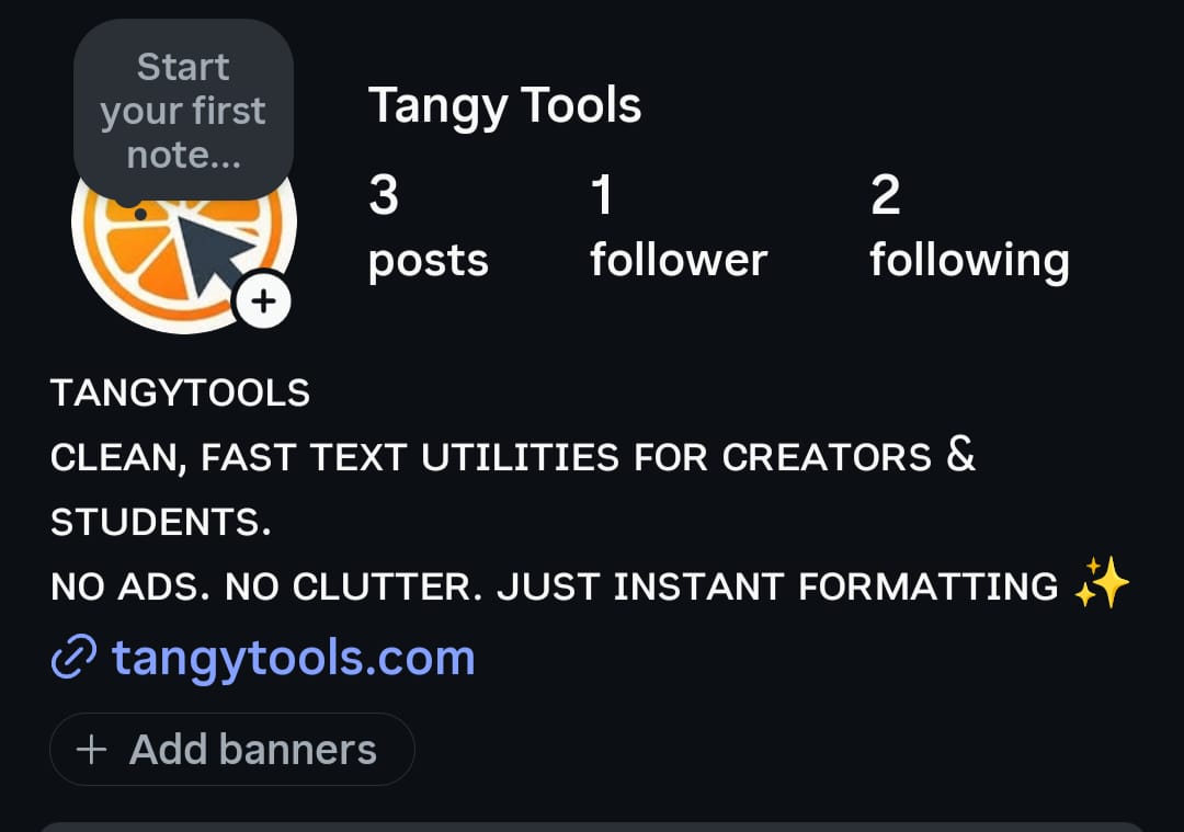
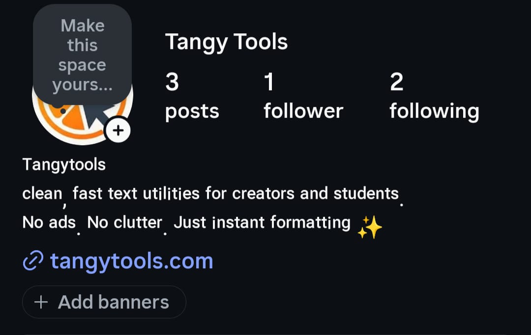
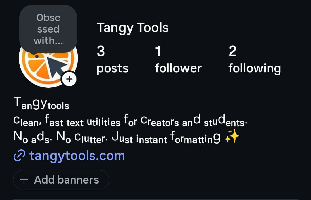
Alphabet Coverage: Which Style Actually Supports Your Word
This is the part most bio generators don’t tell you, and it’s the reason your third tab looked broken.
Small caps has the fullest Latin alphabet coverage of the three. Nearly every letter has a proper small caps equivalent, which is why full words and names usually come out looking even and correct.
Superscript is missing exactly one common letter: there’s no true superscript “q.” Generators fall back to a substitute character that’s close but not quite right. For most words, this is a minor issue since “q” doesn’t show up as often.
Subscript has the biggest gap. There is no subscript version of B, C, D, F, G, Q, W, or Z. If your bio phrase contains any of those letters, a subscript generator has to either fall back to a similar-looking character or leave that letter in normal size, which breaks the clean look you were going for. This is why words like “biz,” “cool,” or your own name can come out looking half-converted.
Before you commit to subscript for anything longer than a few letters, run your exact word through the generator and check it letter by letter. If you see a letter that looks noticeably different in size or shape from the rest, that’s the substitution happening.
Readability and Rendering Across Devices and Apps
Small caps tends to render the most evenly across devices, since its characters map closer to standard Latin letter shapes that most phone fonts already support well. Superscript and subscript characters come from more specialized Unicode blocks, originally added for math and phonetic notation, so device fonts sometimes render them with slightly different spacing or weight than the rest of your bio text. On some older Android devices in particular, spacing between subscript or superscript characters can look tighter or more cramped than intended. These comparisons come from checking each style on iOS Safari, Android Chrome, and a couple of common screen readers, not just eyeballing a single device.
Since small caps, superscript, and subscript are all just standard Unicode characters rather than an Instagram-specific feature, the same text works the same way anywhere Unicode is supported, including TikTok bios, X (Twitter) names, Discord nicknames, and Facebook profiles. The rendering caveats above still apply on those platforms too, so the same letter-coverage check is worth doing before you paste into any of them, not just Instagram.
There’s also an accessibility angle worth knowing before you commit to any of these styles for your main bio line. Screen readers may read tiny text characters aloud by their formal Unicode name, something like “modifier letter small h,” rather than reading the word naturally. This means a subscript or superscript bio line could sound like a string of technical labels to a visually impaired follower using a screen reader, instead of your actual name or tagline. Small caps tends to fare slightly better here since more of its characters map to standard letter code points, but results still vary by screen reader and operating system. If accessibility matters to your audience, keep your primary identifying text, like your actual name, in normal characters, and reserve tiny text styles for secondary, decorative lines.
Best Use Case for Each Style
Small caps works best for anything you want read as a real word: your name, a business tagline, or a short bio line meant to be understood at a glance. Because the alphabet is nearly complete, you don’t have to worry about missing letters breaking the look.
Superscript works best as a short subtitle sitting under a normal-text name, the same way a raised footnote sits next to a sentence. A bio that reads your name normally, then a small raised line underneath like a title or mood, is a common and clean pattern. Keep the superscript portion short, since long superscript phrases get harder to read the longer they run.
Subscript works best for very short accent words, single terms with a math or chemistry feel, or handles where the dropped-line look fits the vibe, as long as the word avoids the missing letters listed above. It’s a poor choice for anything you need to read easily at a glance, since the lowered baseline and occasional letter substitution both work against readability.
The most common real-world pattern across all three styles is the same: keep your actual name in normal text, and apply the tiny text style only to a secondary line. This avoids most of the readability and accessibility issues above while still giving your profile a distinct visual touch.
Worked Example: One Phrase, Three Styles
Here’s the same short phrase run through all three converters, so you can see the difference directly rather than imagining it.
| Input | small biz |
|---|---|
| Small Caps | sᴍᴀʟʟ ʙɪᴢ |
| Superscript | ˢᵐᵃˡˡ ᵇᶦᶻ |
| Subscript | ₛₘₐₗₗ ᵦᵢ𝓏 |
Small caps converts cleanly with no substitutions. Superscript also converts cleanly here, since none of these letters hit the missing “q.” Subscript is where it breaks down: there’s no true subscript “b” or “z,” so those letters fall back to lookalike characters that don’t quite match the rest of the word in size and shape. Run your own phrase through the Subscript Generator and compare it letter by letter before you commit to it for your bio.
If you’re deciding based on how much of your 150-character Instagram bio limit you have left, the Instagram Character Counter will show you exactly how many characters your styled text uses, since tiny text styles still count as one character each, the same as normal letters.
How to Add Tiny Text to Your Bio
Once you’ve picked a style, getting it into your bio takes three steps:
- Type your word or phrase into the generator for the style you’ve chosen, then review the output letter by letter for any substituted characters.
- Copy the converted text, then open your profile’s bio or display name field on whichever app you’re using (Instagram, TikTok, X, Discord, or Facebook).
- Paste the text in and save your profile. Since it’s just Unicode text, no special formatting or app permissions are needed, and it will display the same way it looked in the generator, subject to the device rendering differences covered above.
FAQs
Q1. Which tiny text style looks best in an Instagram bio?
A1. Small caps generally looks the cleanest for full words and names, since it has the most complete alphabet. Superscript and subscript work better as short, secondary accents rather than your main bio line.
Q2. Why does my tiny text look broken on some phones but not others?
A2. Different devices render specialized Unicode characters slightly differently. Subscript and superscript in particular can look cramped or spaced oddly on some Android fonts, and any missing letters in your word will show up as substituted characters rather than converting cleanly.
Q3. Can I mix small caps, superscript, and subscript in the same bio?
A3. Yes, and it’s a common pattern to keep your name in one style, like normal text or small caps, and use a different style like superscript for a subtitle line underneath. Mixing all three in one phrase usually looks cluttered rather than intentional.
Q4. Does using tiny text in my bio affect accessibility for visually impaired followers?
A4. It can. Screen readers sometimes read these characters by their formal Unicode names instead of as normal letters, which can make a bio sound confusing when read aloud. Keeping your actual name in normal text and limiting tiny text to secondary lines reduces this risk.
Q5. Why doesn’t Unicode have a full subscript alphabet?
A5. Subscript characters were added to Unicode for specific purposes like chemistry and math notation, not as a decorative alphabet. Coverage grew unevenly over time, which is why letters like B, C, D, F, G, Q, W, and Z were never included as true subscript characters.
Q6. Does this tiny text work outside of Instagram?
A6. Yes. Small caps, superscript, and subscript are standard Unicode characters, not an Instagram feature, so the same converted text works on TikTok, X (Twitter), Discord, Facebook, and anywhere else Unicode text is accepted. The same rendering and missing-letter caveats apply on those platforms too.
Conclusion
If you just needed a quick answer, small caps is the safest default for full words, superscript works well for a short subtitle, and subscript is best saved for short accent words that dodge the missing letters. For the complete picture on subscript specifically, including its full character set, more use cases, and common mistakes, read our Subscript Text: The Complete Guide.